Canadian Tire – Impressions of Play
Logo Design | Graphic Design | Print Production
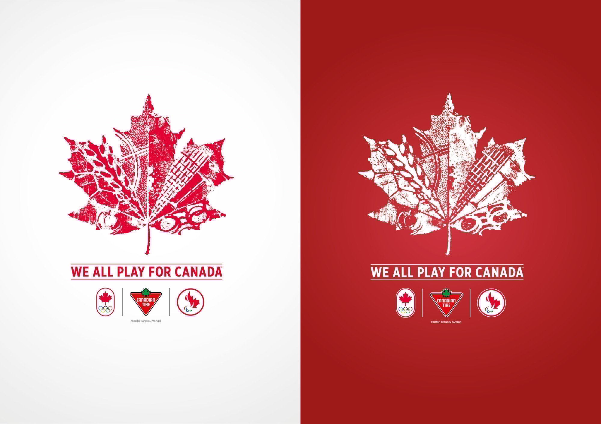
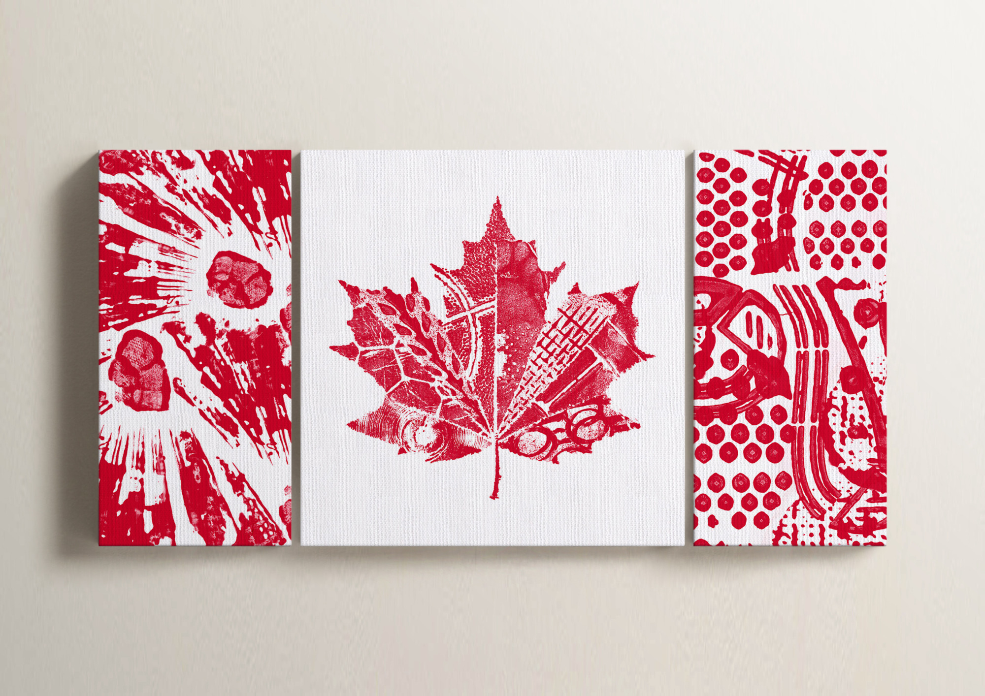
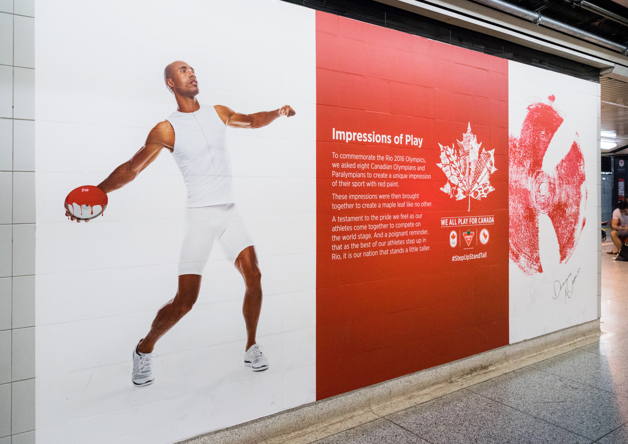
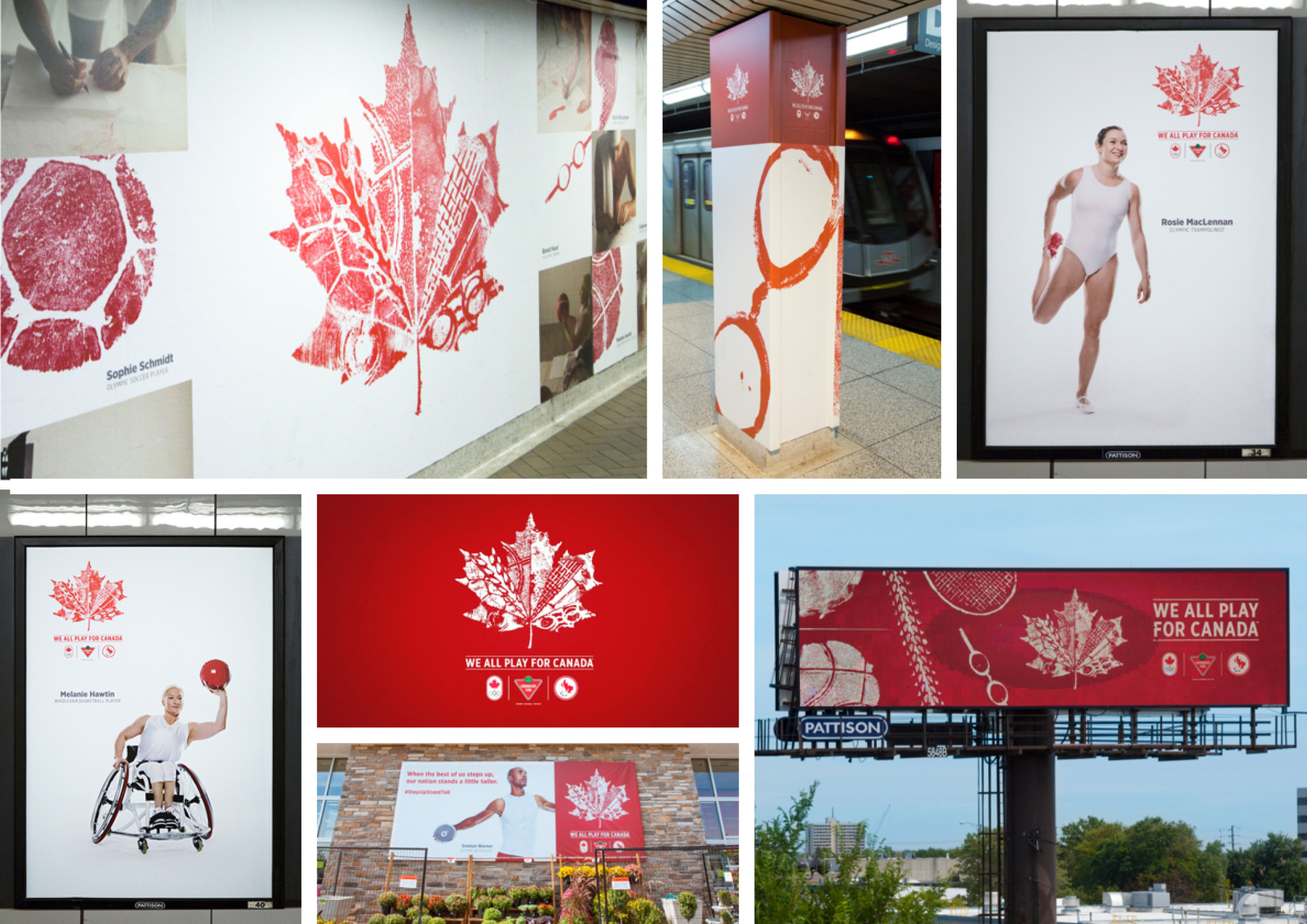
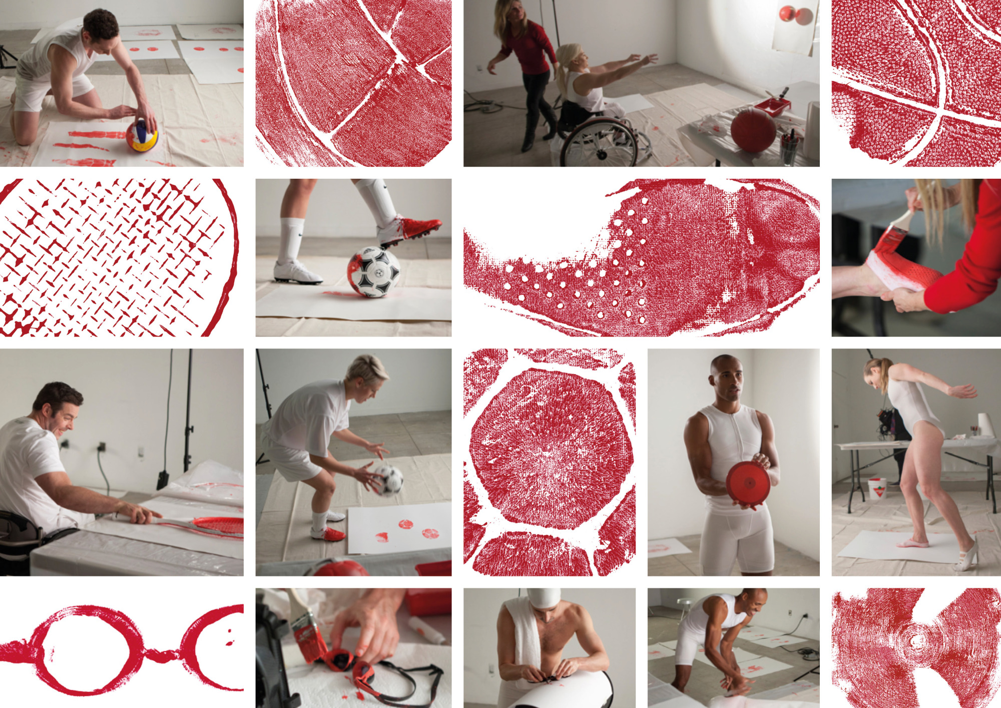
For Canadian Tire’s 2016 Olympic campaign, eight Canadian Olympians and Paralympians were invited to create literal impressions of their sport — stamping tennis rackets, basketballs, bicycle tires, and more in red paint onto white canvas. My role was to take those raw imprints and bring them together into a single, unified symbol: a maple leaf. The final logo combined each athlete’s mark to form a proud, layered emblem of Canadian sport and national spirit.
The logo became a central element in a broader campaign that celebrated community, unity, and pride — and went on to win both local and international awards. I contributed as the graphic designer and production artist across the campaign, as part of a larger team effort.