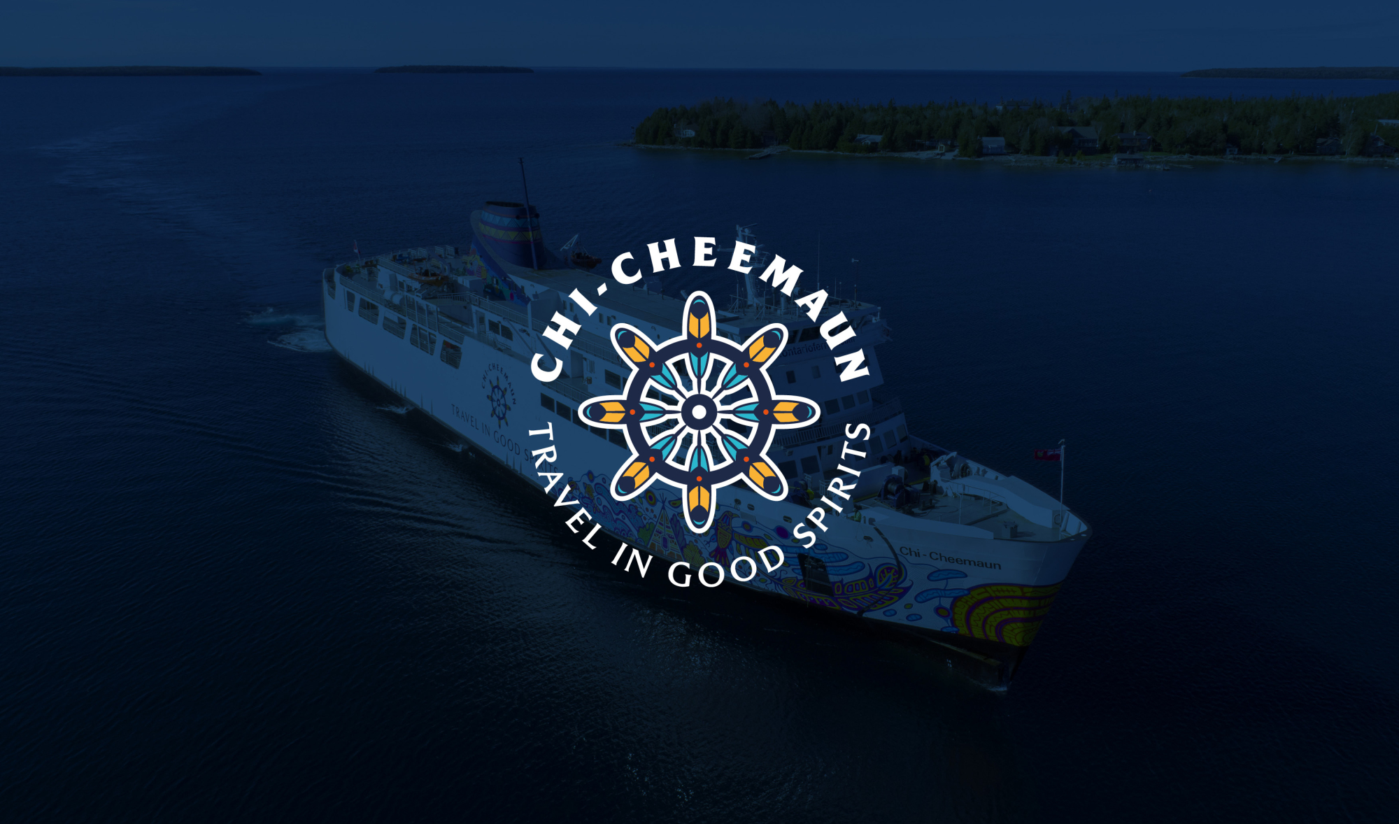
Chi-Cheemaun Ferry
Brand identity | Illustration | Graphic Design | Print Production
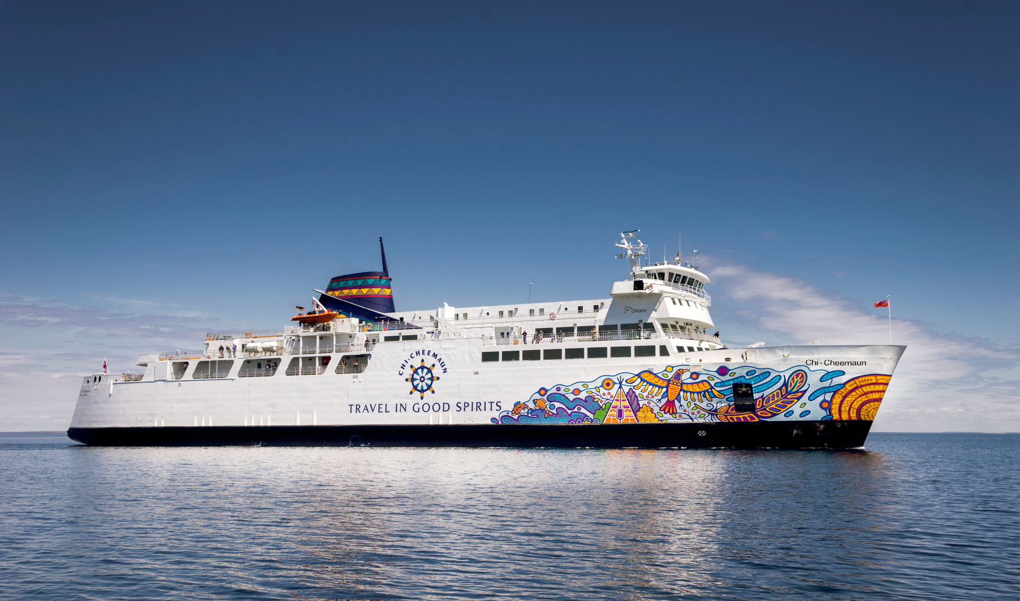
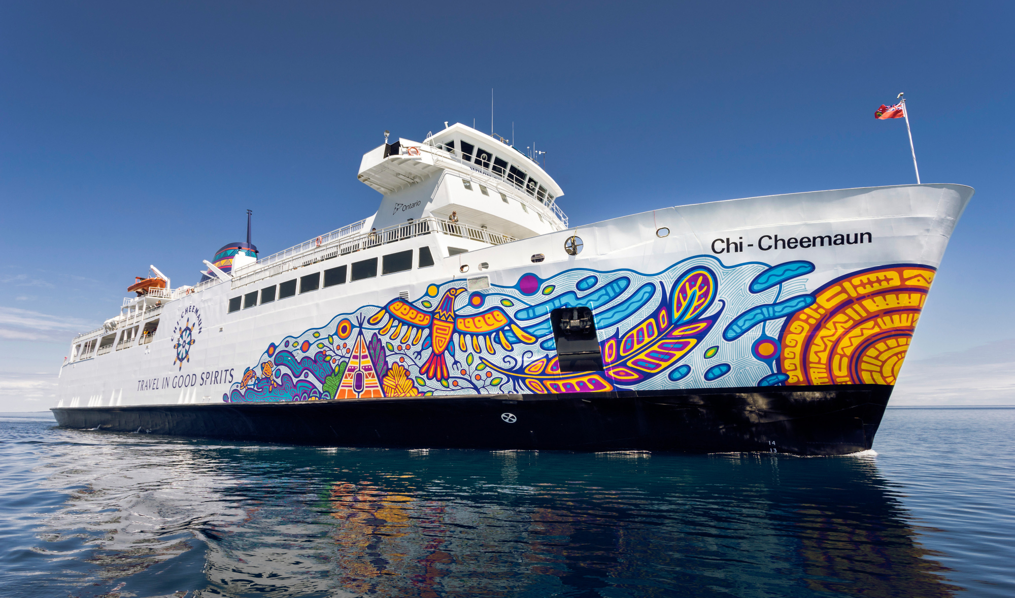
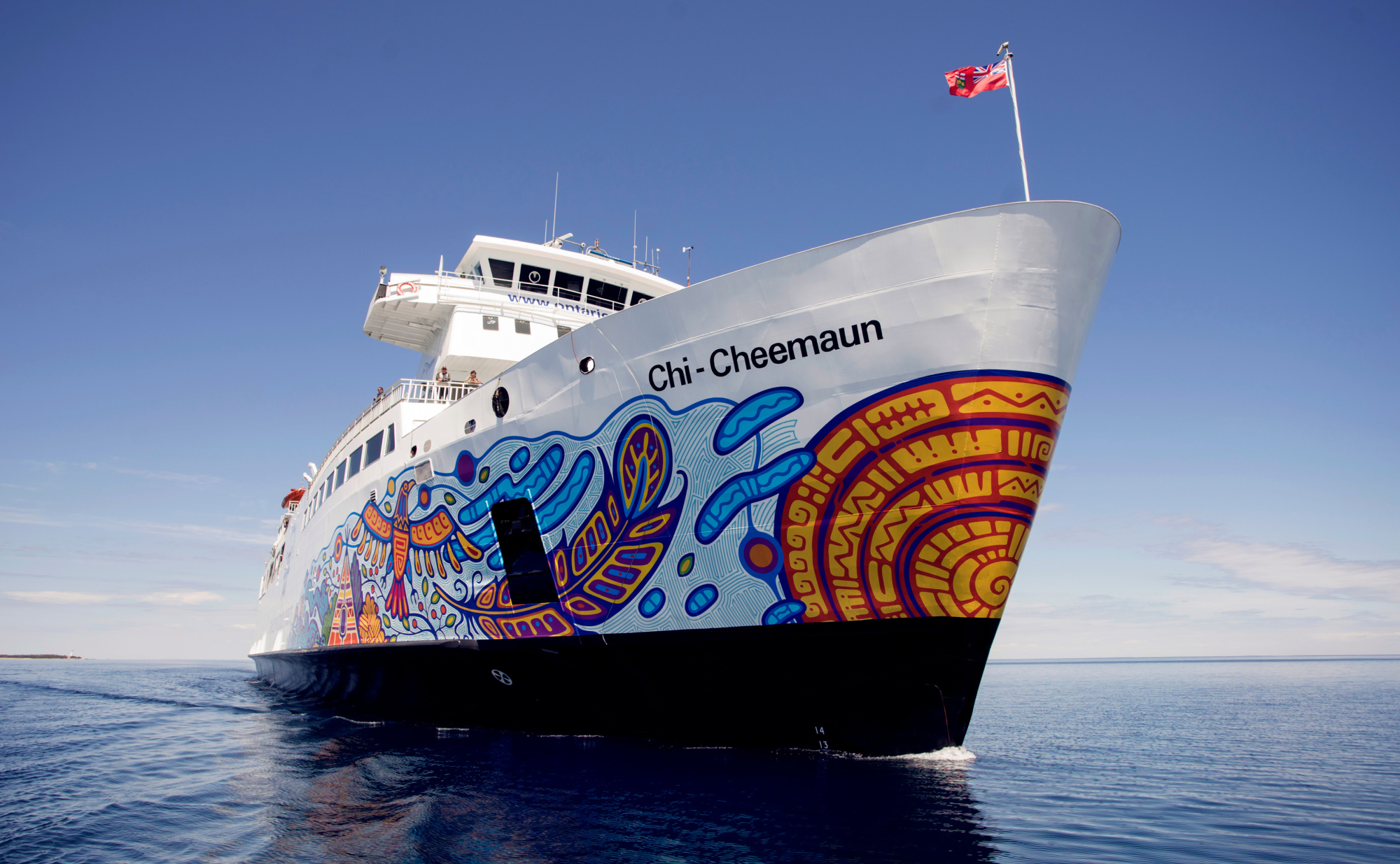
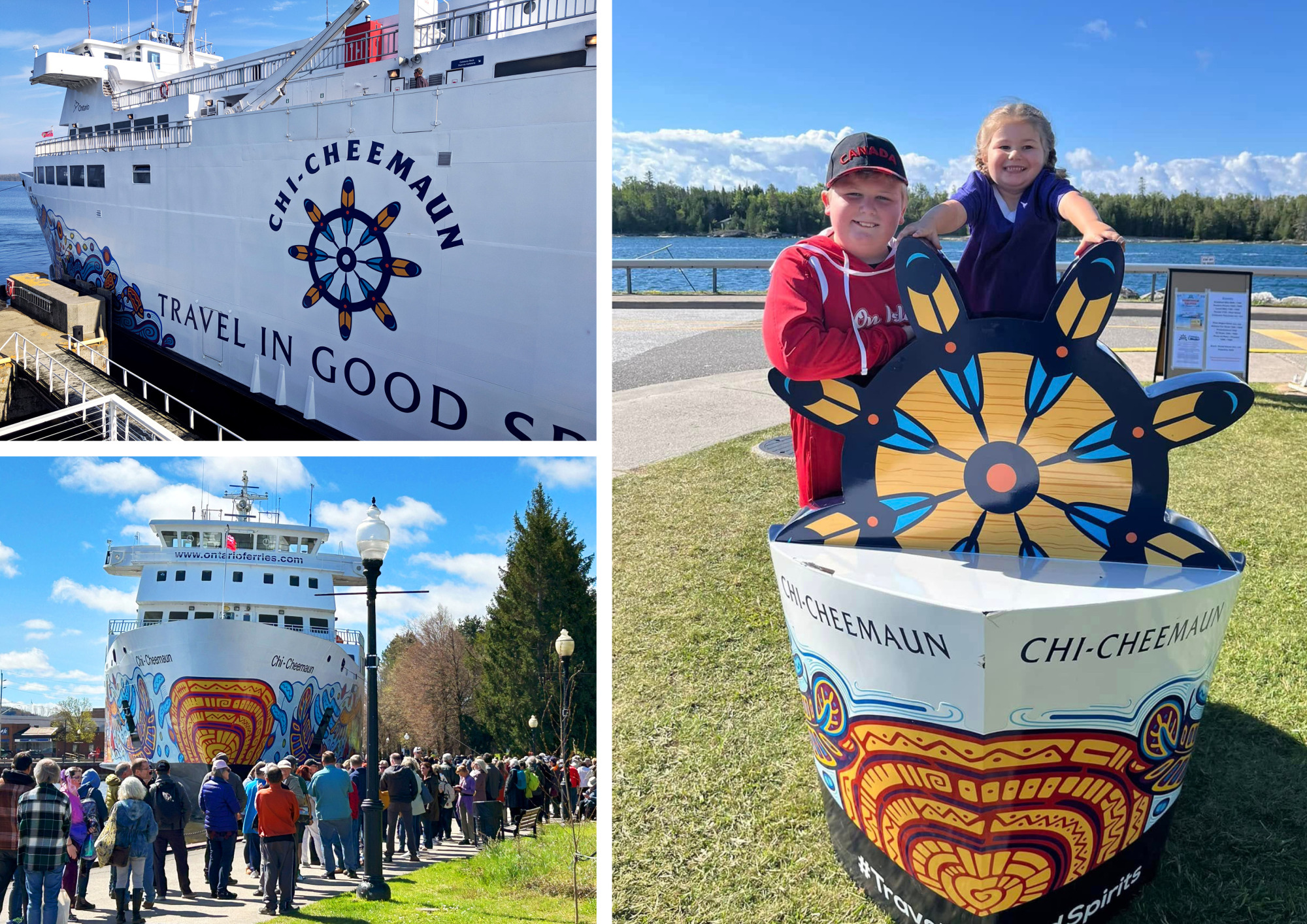
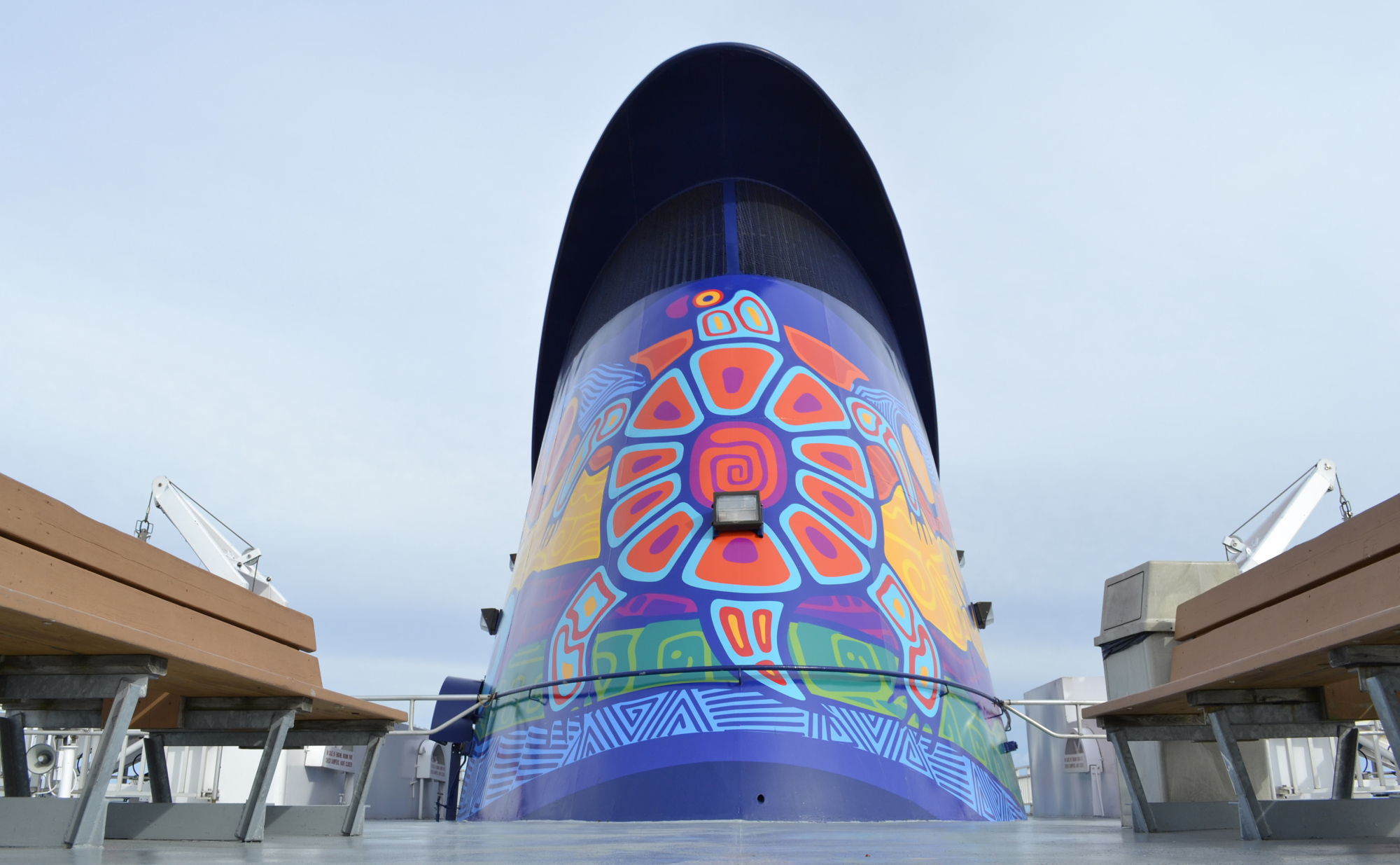
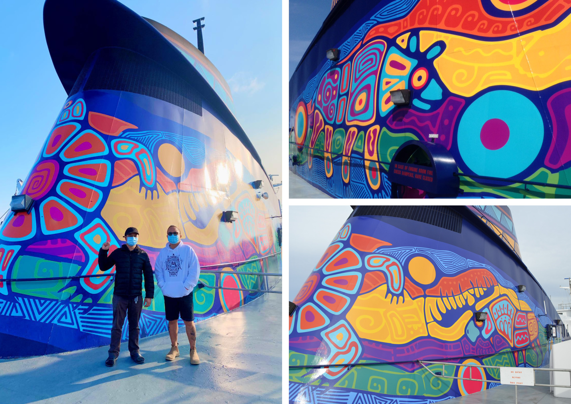
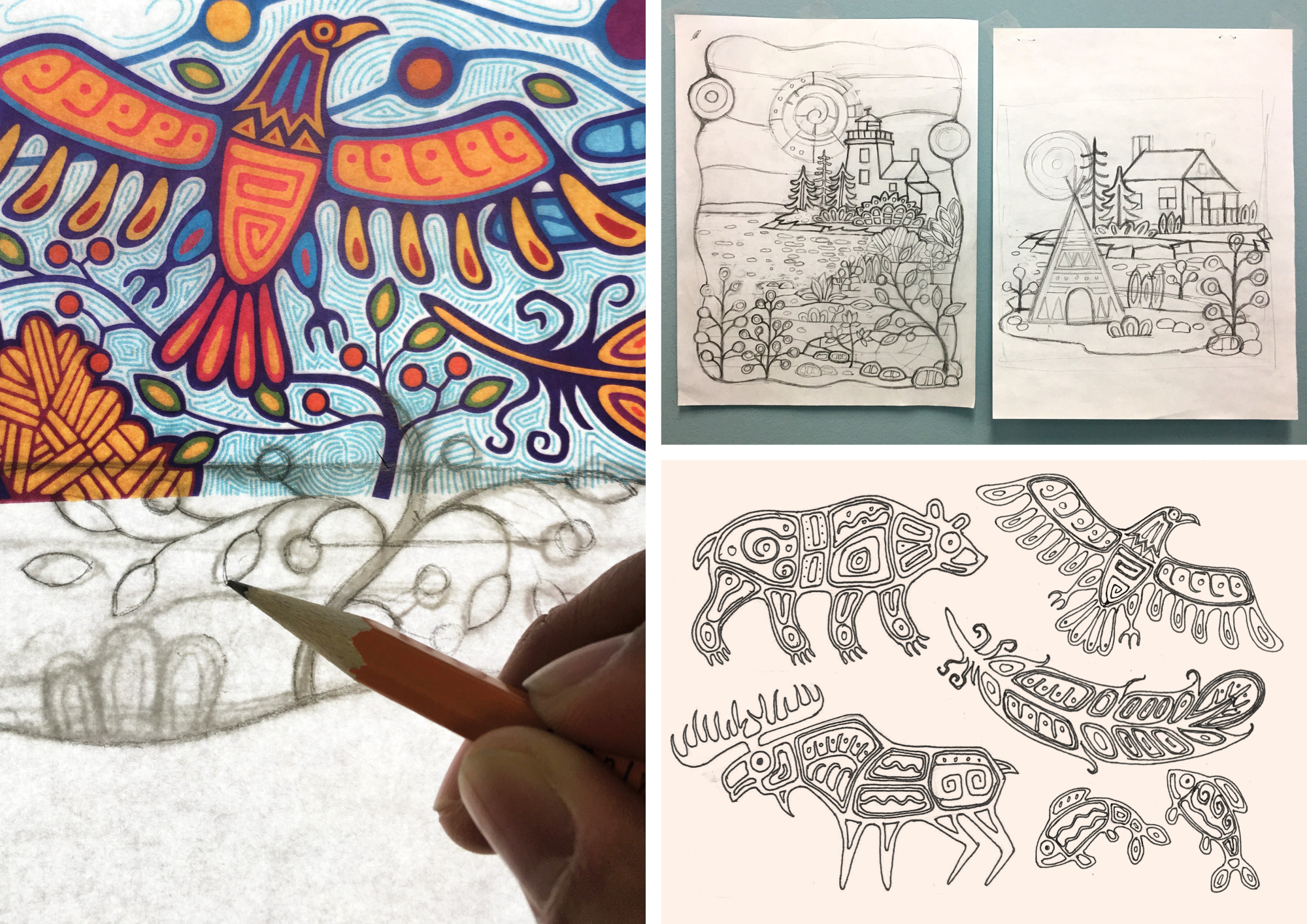
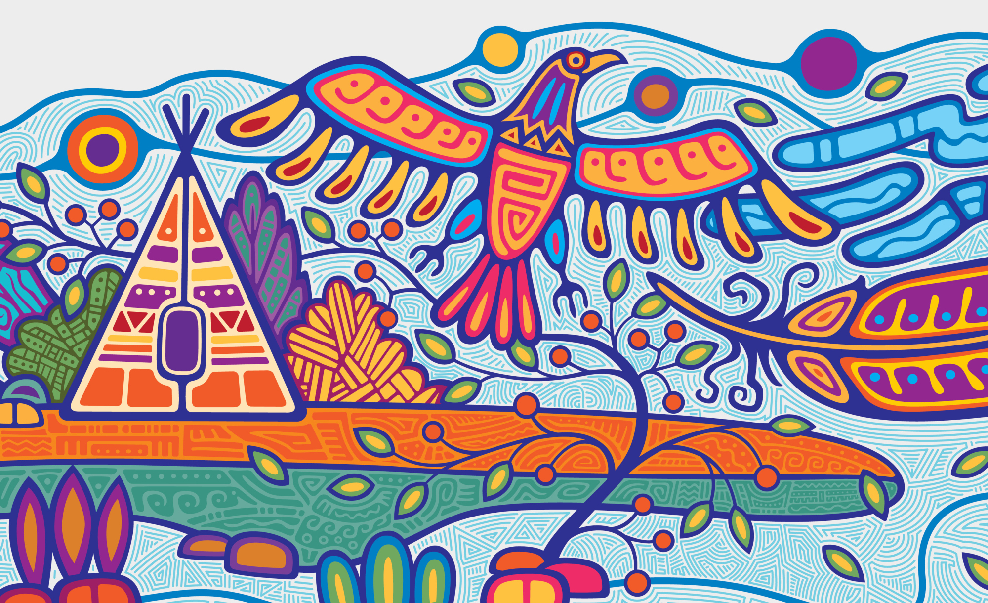
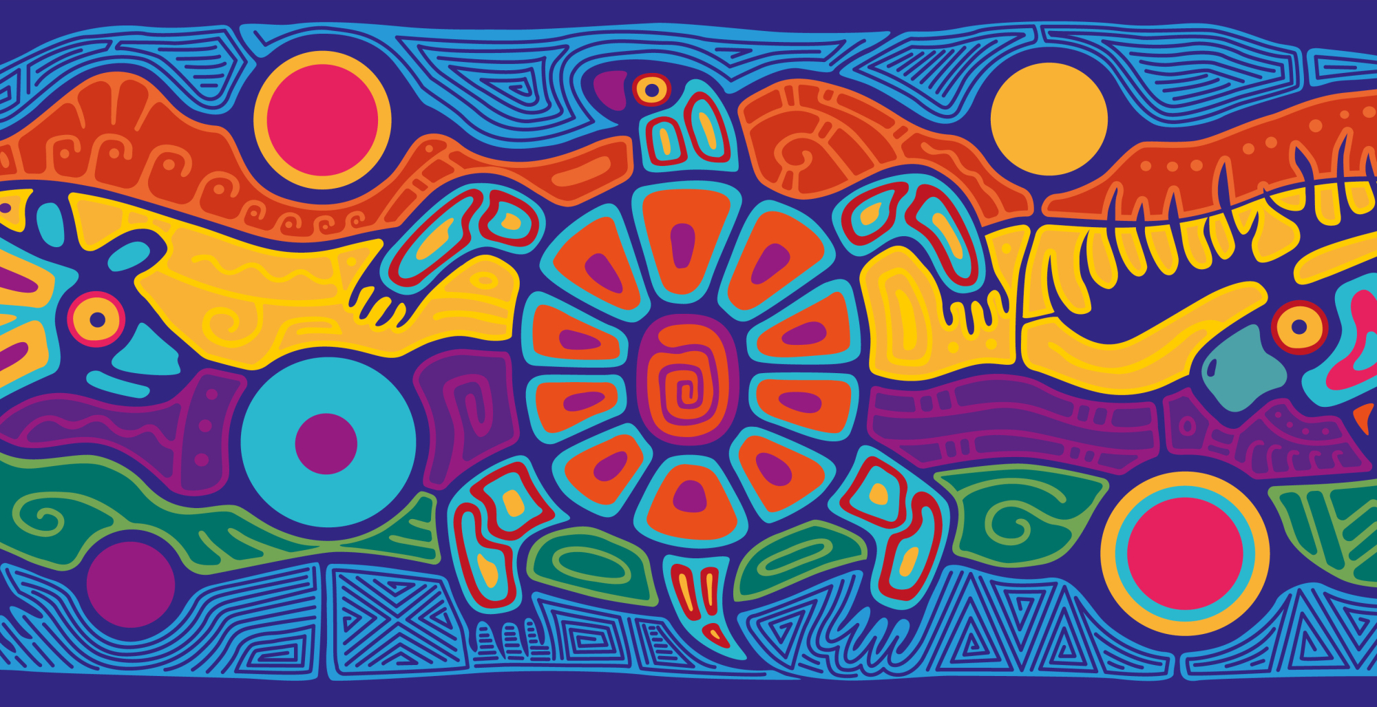
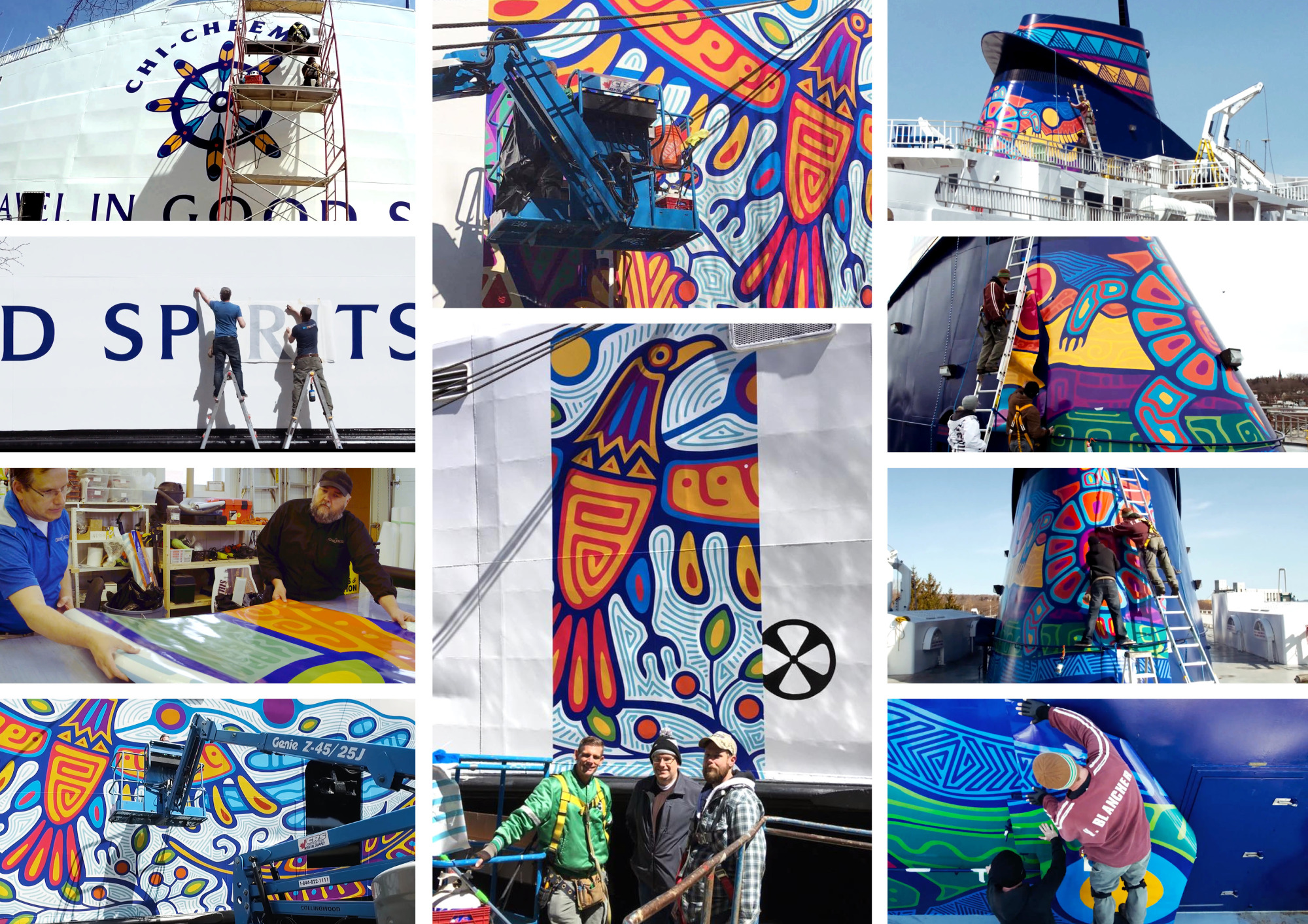
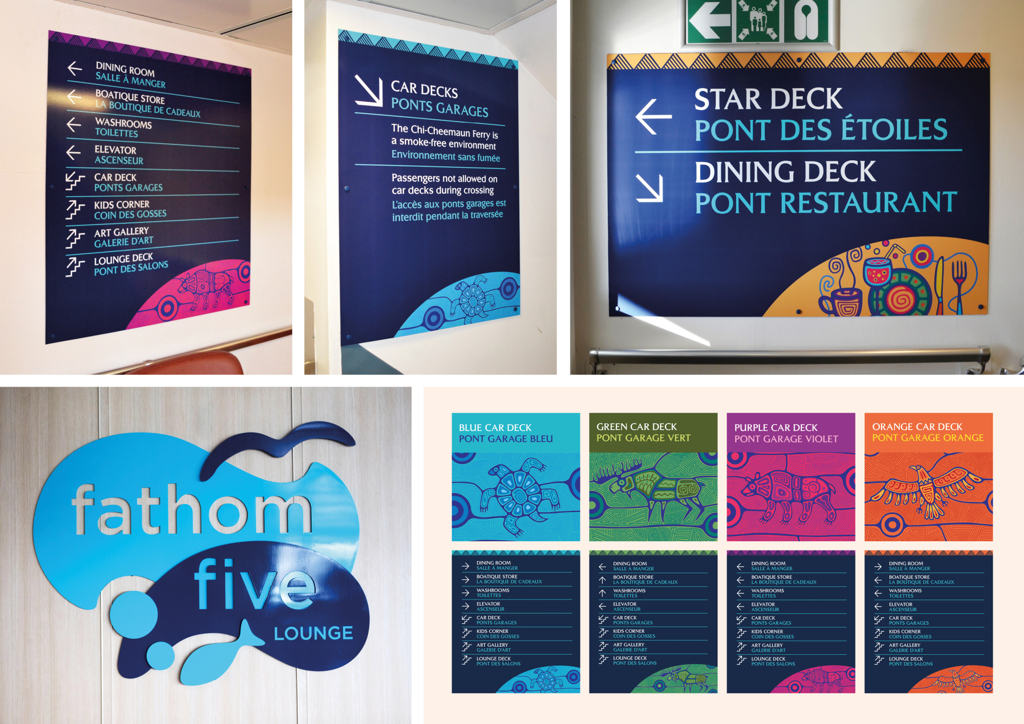
To help reposition the Chi-Cheemaun Ferry as more than just transportation, I was tasked with creating a new identity and visual language that would reflect the ferry’s cultural and geographical significance. The design was inspired by Woodland Art, a traditional style practiced by First Nations artists in Canada. As the ferry travels to Manitoulin Island, home to Indigenous communities, it was important that the illustration be not only aesthetically pleasing, but also culturally meaningful. I spent time researching the symbolism behind the forms, ensuring the illustration was not only visually strong, but also respectful. Once complete, the artwork was presented to seven elders from the island for review — and was approved without changes.
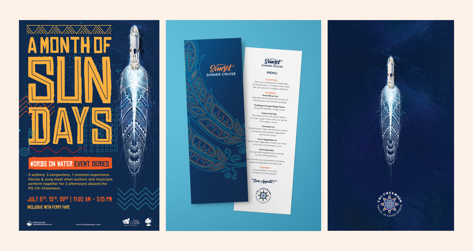
The logo was also approved on the first round, and even the unused logo options were adapted across other applications, so nothing went to waste. The illustrations were applied at a massive scale — from full-ship decals to signage, wayfinding, and merchandise. Seeing the work installed in person was breathtaking. People took photos at the docks, on board, even mid-journey — and social media filled with images and praise. The final design helped transform the ferry into a floating cultural landmark — something people didn’t just ride, but remembered.